Anabolix Sections
On our dedicated sales event features page, we offer a comprehensive overview of all the tools and options at your disposal. From website alterations to code snippets and schema settings, this resource provides you with the insights and guidance needed to make your sales events a resounding success. Explore how you can optimize your online presence, boost conversions, and enhance the customer shopping experience with these powerful features.
Homepage Featured Products
Homepage grids for displaying featured products.
Images
- Name
Background image- Type
- JPEG | PNG | GIF
- Description
Example image with inset wording guidelines. 900px by 900px with a 150px bleed (750px by 750px).
Preview
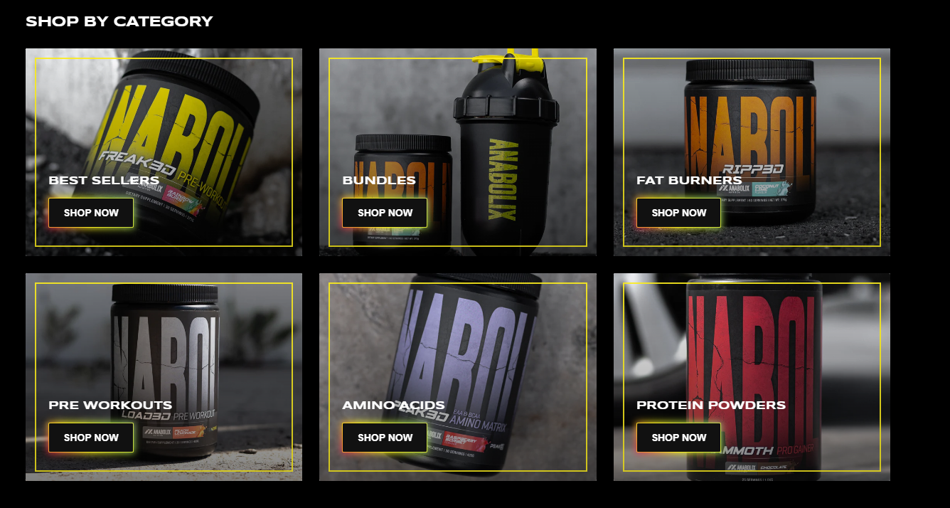
Homepage Category Cards
Homepage category grids for displaying the product categories.
Images
- Name
Background image- Type
- JPEG | PNG | GIF
- Description
Example image with inset wording guidelines. 900px by 900px with a 150px bleed (750px by 750px).
Preview
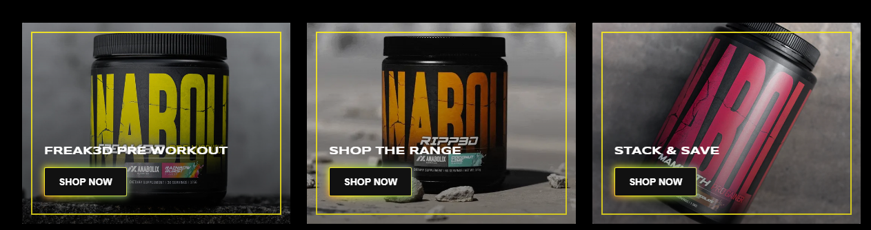
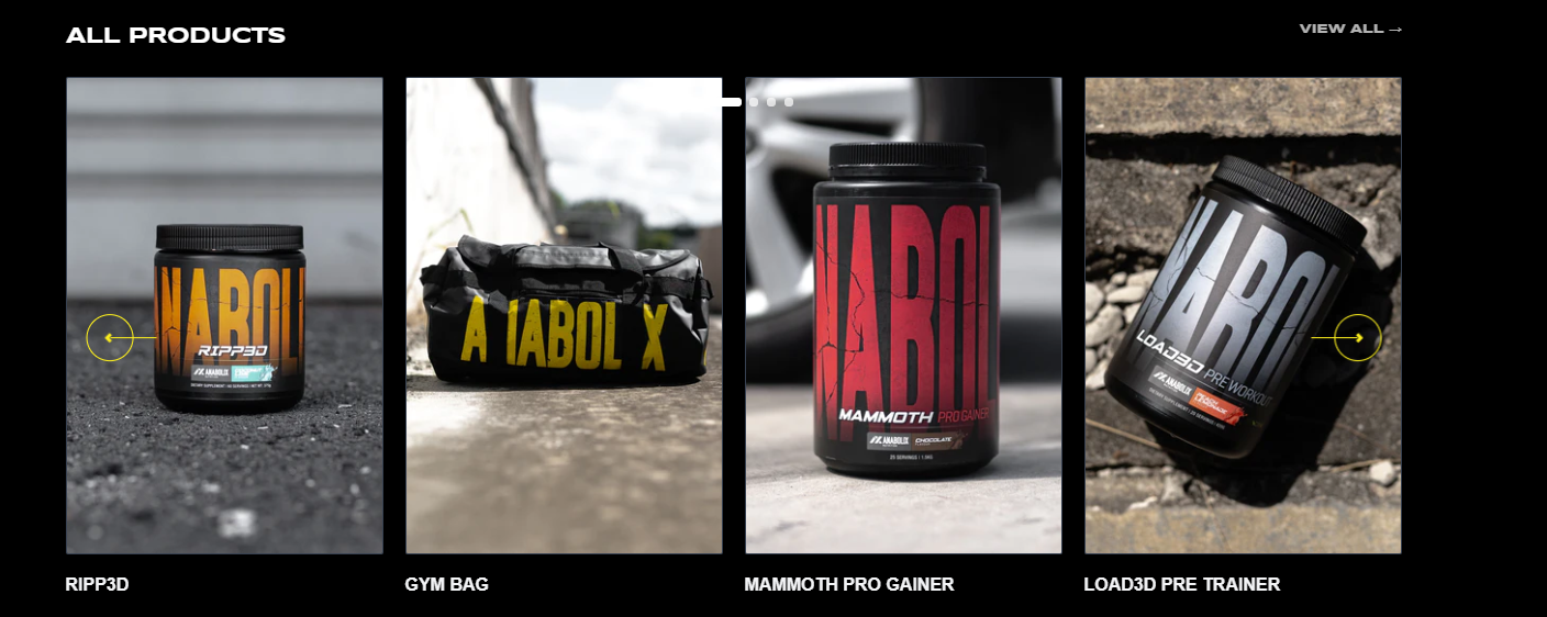
Homepage Product Slider
Display products within collection as a sliding row or as a grid. Can choose products from particular collection or create own lists of products. Can display a maximun of 5 products in a row using Carousel. The product card has a feature of displaying their featured image or other image from their metafield.
Section States
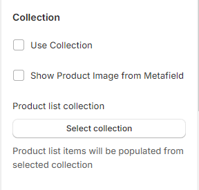
- Name
Use Collection- Type
- checkbox
- Description
Enable to choose the collection as a Product Slider / Lists
Schema Settings
Preview
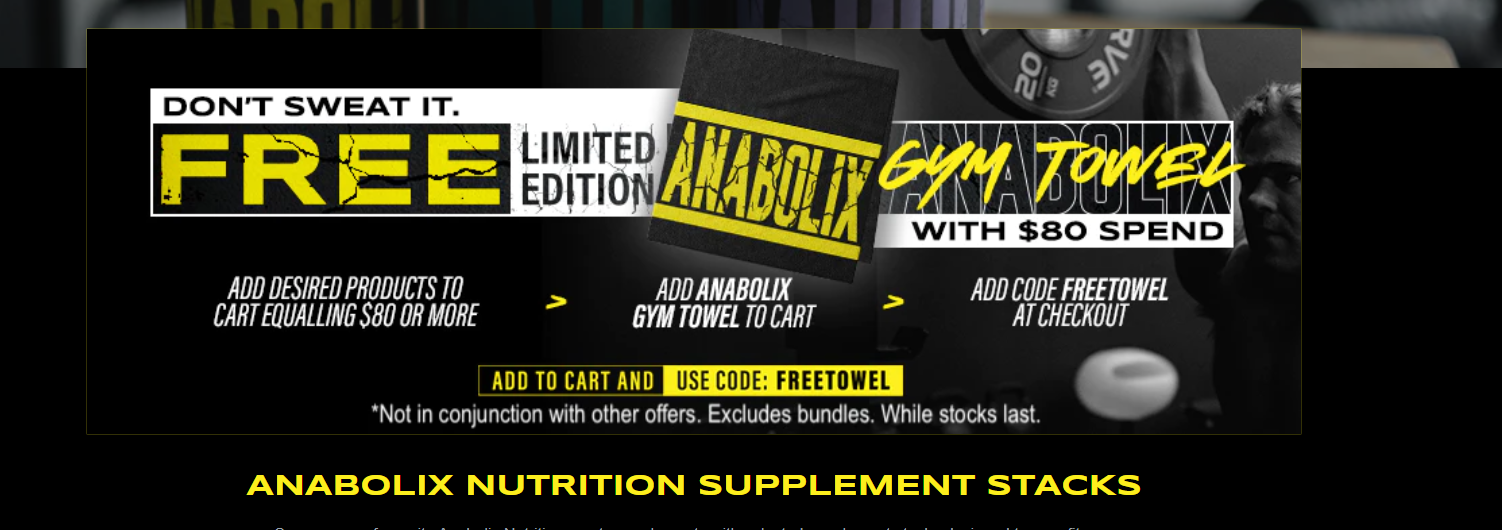
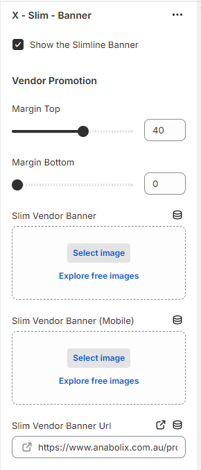
Slim Banner
The Global Slim Banner is a user-friendly and effective way to display important messages, promotions, alerts, or announcements at the top of page content. Here, you can get an insights and guidance of using global slim banner effectively on your website. Please note that the section is added as Collection/Slim - Banner at the collection page due to varying page type.
Section States
- Name
Show Slimline Banner- Type
- checkbox
- Description
Enable to display the banner at the page.
Schema Settings
Preview