Nutrition Warehouse Sections
On our dedicated sales event features page, we offer a comprehensive overview of all the tools and options at your disposal. From website alterations to code snippets and schema settings, this resource provides you with the insights and guidance needed to make your sales events a resounding success. Explore how you can optimize your online presence, boost conversions, and enhance the customer shopping experience with these powerful features.
Some sections have two "Custom CSS" input boxes. (Added before shopify update). Add CSS to dropdown input if you want the css to affect the individual section only (scoped). Add to input within the section to affect all instances of the section on the page.
Section Boilerplate
Boilerplate code for building sections from scratch
  <div class="x-boilerplate">
    <div class="container {% if section.settings.use_container %} x-container {% endif %} {{ section.settings.css_class }}">
      <h1>Boilerplate</h1>
    </div>
  </div>

  <style>
  {% comment %}/* Section Styles */{% endcomment %}
  #shopify-section-{{ section.id }} .x-boilerplate {
    background: {{ section.settings.background_colour }};
    padding-top: {{ section.settings.padding_top }}px;
    padding-bottom: {{ section.settings.padding_bottom }}px;
    margin-top: {{ section.settings.margin_top }}px;
    margin-bottom: {{ section.settings.margin_bottom }}px;
  }

  /* Mobile */
  @media (max-width: 640px) {}
  /* Mobile */

  {% comment %}/* Container */{% endcomment %}
  #shopify-section-{{ section.id }} .x-container {width: 100% !important; margin: 0 auto;}
  @media (min-width: 640px) {#shopify-section-{{ section.id }} .x-container {max-width: 640px !important;}}
  @media (min-width: 768px) {#shopify-section-{{ section.id }} .x-container {max-width: 768px !important;}}
  @media (min-width: 1024px) {#shopify-section-{{ section.id }} .x-container {max-width: 1024px !important;}}
  @media (min-width: 1280px) {#shopify-section-{{ section.id }} .x-container {max-width: 1280px !important;}}
  @media (min-width: 1536px) {#shopify-section-{{ section.id }} .x-container {max-width: 1536px !important;}}
  {% comment %}/* Container */{% endcomment %}

  {% comment %}/* Advanced */{% endcomment %}
  {{ section.settings.custom_css }}
  {% comment %}/* Advanced */{% endcomment %}
  </style>

  {% schema %}

  {
    "name": "Boilerplate 🏝",
    "class": "x-boilerplate",
    "settings": [
      {
        "type": "header",
        "content": "Layout"
      },
      {
        "type": "checkbox",
        "id": "use_container",
        "label": "Use Container",
        "default": true
      },
      {
        "type": "color",
        "id": "background_colour",
        "label": "Background Colour",
        "default": "#FFF"
      },
      {
        "type": "header",
        "content": "Spacing"
      }, {
        "type": "range",
        "id": "padding_top",
        "label": "Padding Top",
        "default": 25,
        "min": -100,
        "max": 200,
        "step": 5,
        "unit": "px"
      }, {
        "type": "range",
        "id": "padding_bottom",
        "label": "Padding Bottom",
        "default": 25,
        "min": -100,
        "max": 200,
        "step": 5,
        "unit": "px"
      }, {
        "type": "range",
        "id": "margin_top",
        "label": "Margin Top",
        "default": 25,
        "min": -100,
        "max": 200,
        "step": 5,
        "unit": "px"
      }, {
        "type": "range",
        "id": "margin_bottom",
        "label": "Margin Bottom",
        "default": 25,
        "min": -100,
        "max": 200,
        "step": 5,
        "unit": "px"
      }, {
        "type": "header",
        "content": "Advanced"
      }, {
        "type": "text",
        "id": "css_class",
        "label": "CSS Class"
      }, {
        "type": "textarea",
        "id": "custom_css",
        "label": "Custom CSS",
        "info": "Write your css here to make advanced adjustments"
      }
    ],
    "presets": [
      {
        "name": "Boilerplate 🏝",
        "category": "boilerplate"
      }
    ]
  }

  {% endschema %}
Homepage Image Links
Homepage promotional tiles for displaying large deals and sales.
Images
- Name
Background image- Type
- JPEG | PNG | GIF
- Description
Example image with inset wording guidelines. 900px by 900px with a 150px bleed (750px by 750px). Example Image Example Image
Preview
Promo Product Row
Display products within collection as a sliding row. Stacks on mobile and has quick add feature for products with 8 or less variants
Preview
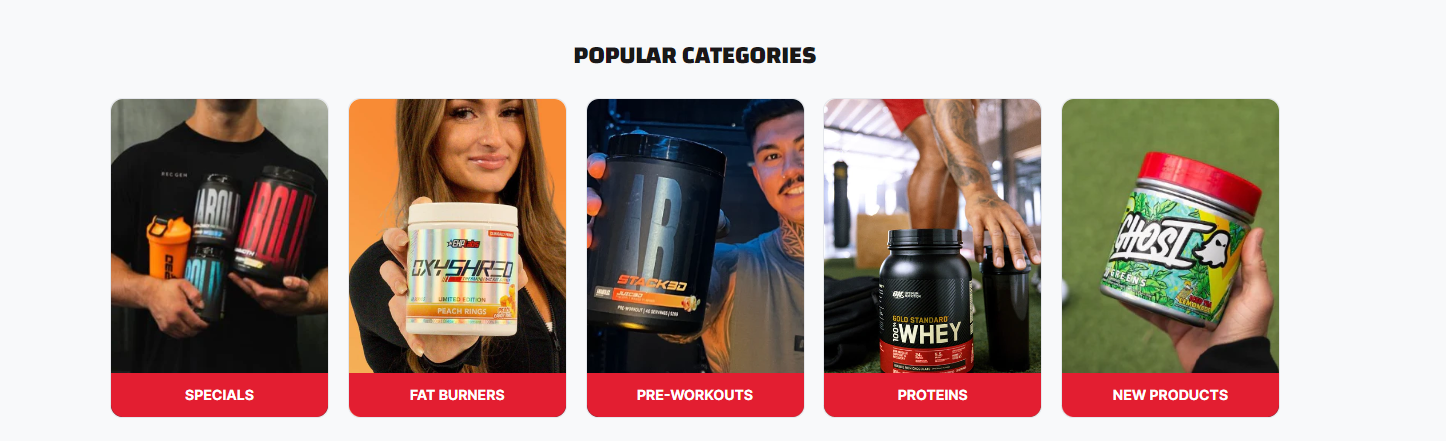
Promo Tiles
Customizable promotion tiles which can be used as links to specific products or collections
Preview
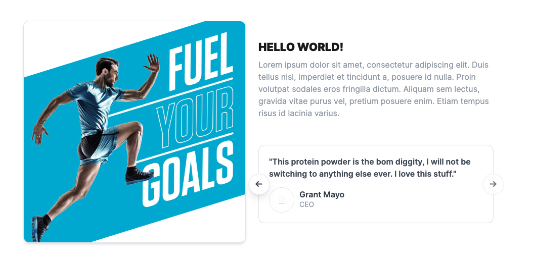
Promo Feature
Customizable promotion section with display image, text and testimonials. Used to build trust in the products or brand
Preview
Promo Image Block
Section to display promotional images, layout graphics and styled images with text - Ideal for slim banners or other images with text. The container will conform the size of the image
Custom CSS Additions
Add these CSS snippets to the Custom CSS input box within the shopify admin theme customizer for the results to show.
- Name
Scale Animation- Type
- Custom CSS
- Description
Make the image expand within the container when a user hovers the section.
- Name
Border Fix- Type
- Custom CSS
- Description
On particular images the border of the container will be square which does not match the brand guide lines. This CSS will fix the issue
  /* Scale image on hover */
  .nwh-promo-fullwidth__bg {
    border-radius: 4px !important;
    overflow: hidden;
  }
Preview
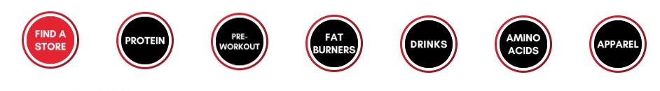
Shop By Link (NWH)
Group of small links usually connected to collections which show promotional information and a background image. Stacks on mobile
Custom CSS Additions
Add these CSS snippets to the Custom CSS input box within the shopify admin theme customizer for the results to show.
- Name
Equal height- Type
- Custom CSS
- Description
Make the links all have an equal height. Take note of responsive screen sizes and long link names as overflow can occur
- Name
Larger gap- Type
- Custom CSS
- Description
Match the gap between link items to the link gap of the promo link row. Used to keep maintain consistency across layout design
- Name
New promo style- Type
- Custom CSS
- Description
Matching the new promo landing page design. Items have deeper box shadow, longer border radius and added border
  /* Match Item Height */
  .nwh-shop-by-links__content span {
    min-height: 42px;
  }
Preview
404 Category Grid
Promotional tiles for displaying categories.
Images
- Name
Background image- Type
- JPEG | PNG
- Description
Add Categories or products that you want to display at landing pages.
Preview
Stories Links
Hot links designed to look like instagram stories selectors
Images
- Name
Dark Mode- Type
- Schema
- Description
Add dark mode to section
- Name
Link Image- Type
- Image
- Description
Recommended image dimensions are 300px by 300px: Example image
Preview
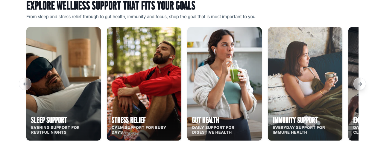
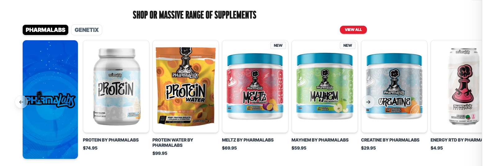
Collection Selector
Product row section with multiple selectable collections
Preview
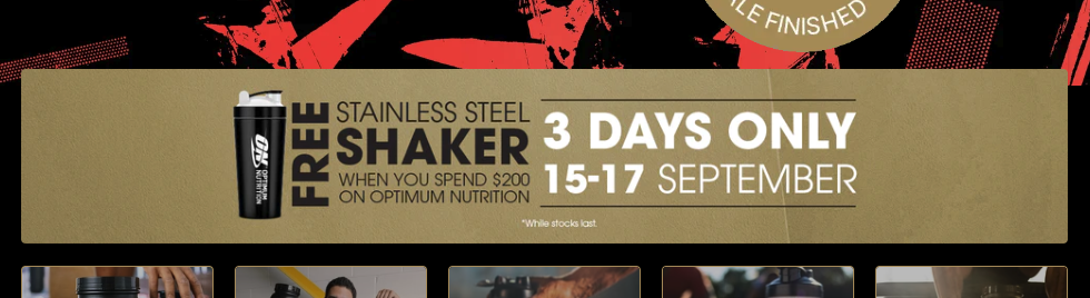
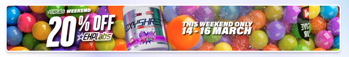
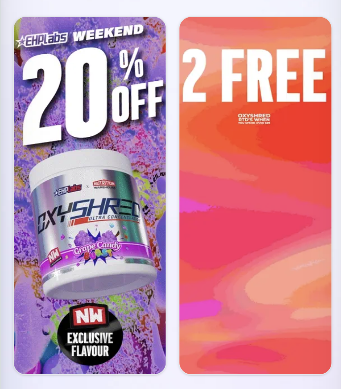
Slimline Banner
Features a narrow, horizontal layout ideal for promotional messages or announcements without taking up much screen space.
Properties
- Name
Show Slimline Banner- Type
- checkbox
- Description
Enable the checbox to show the slimline banner.
- Name
Use Video- Type
- checkbox
- Description
Able to set a video as background.
Preview
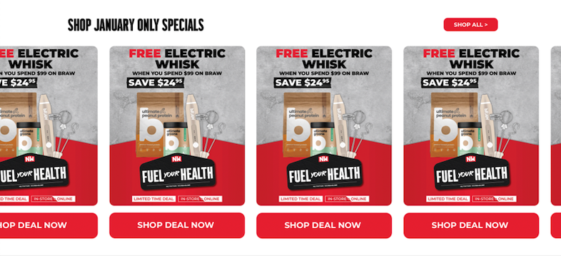
Homepage Deals Slider
Monthly Special Deals
Properties
- Name
Show Slimline Banner- Type
- checkbox
- Description
Enable the checbox to show the slimline banner.
- Name
Use Video- Type
- checkbox
- Description
Able to set a video as background.
Preview
Slimline Split Banner
Designed with a narrow, vertical layout, perfect for displaying promotional messages or announcements, with two side-by-side for an optimal mobile-friendly experience.
Properties
- Name
Background Color- Type
- schema
- Description
Able to select a background color.
- Name
Stack Desktop Images- Type
- checkbox
- Description
Able to set a video as background.
Preview
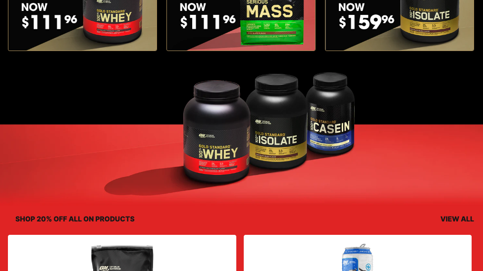
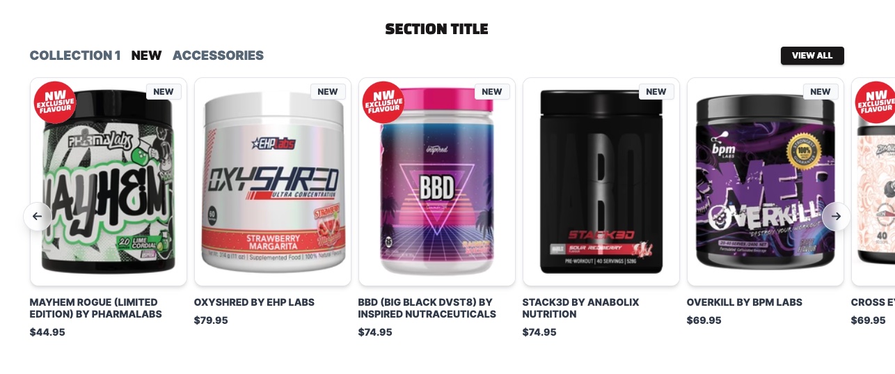
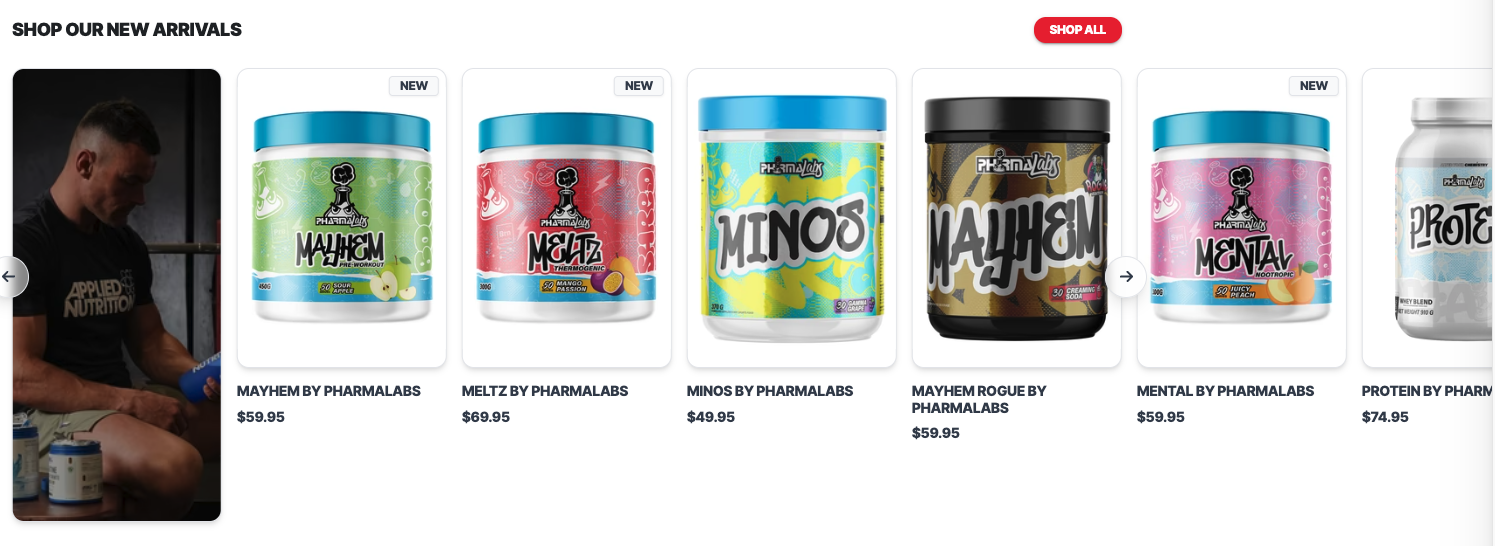
Promo Product Slider
A versatile product row section for promotions, allowing either selected products or lifestyle images to be showcased.
Properties
- Name
Background Color- Type
- schema
- Description
Able to select a background color.
- Name
Dark Mode- Type
- checkbox
- Description
Set a dark background color.
Preview
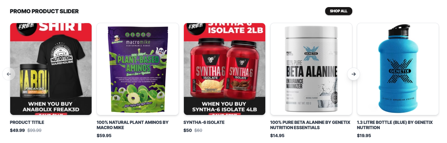
Image Slider
An interactive carousel that displays multiple images acting as a clickable link to pages, products, or external content.
Properties
- Name
Background Color- Type
- schema
- Description
Able to select a background color.
- Name
Show Navigation Arrows- Type
- checkbox
- Description
Checkbox to show/hide navigation arrows.
Preview
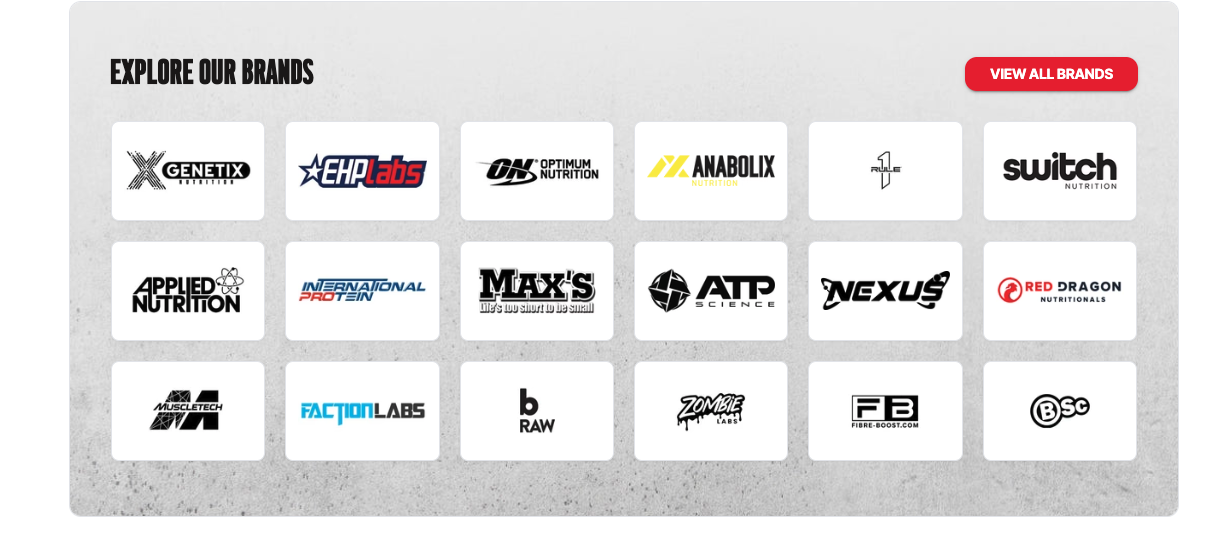
Brand Blocks
Brand links provide quick access to featured brands, helping users easily explore collections, products, and exclusive offerings from their favorite names in one convenient place.
Properties
- Name
Background Image- Type
- schema
- Description
Able to select a background image for the section.
- Name
Background Image Position- Type
- select
- Description
Able to select the background image position.
Preview
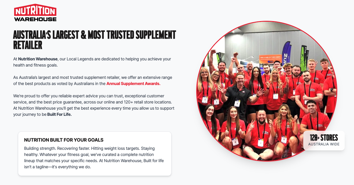
NWH Info Split
A visually engaging split-content section combining impactful imagery with informative text, followed by a dynamic content slider to highlight key features or brand messages.
Properties
- Name
Use Container- Type
- checkbox
- Description
Able to use the container for the section.
- Name
Background Color- Type
- select
- Description
Able to select the background color for the section.
Preview
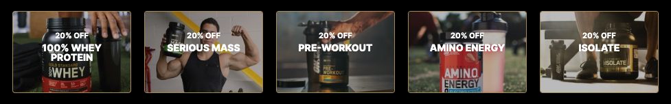
Promo Links Row
A promotional link row designed to showcase featured products in a clean split-layout, making it easy for users to explore offers, categories, and highlighted deals at a glance.
Properties
- Name
Number of columns- Type
- select
- Description
Able to select the number of coulumns for the promo content (max 4 columns).
- Name
Mobile Column Split- Type
- checkbox
- Description
Displays the column 50% width on mobile.
Preview
NWH Banner
A promotional link row designed to showcase featured products in a clean split-layout, making it easy for users to explore offers, categories, and highlighted deals at a glance.
Properties
- Name
Backgroud Color- Type
- color
- Description
Able to select the background color for the section.
- Name
Use Animation- Type
- checkbox
- Description
Enable animation for the section.
Preview
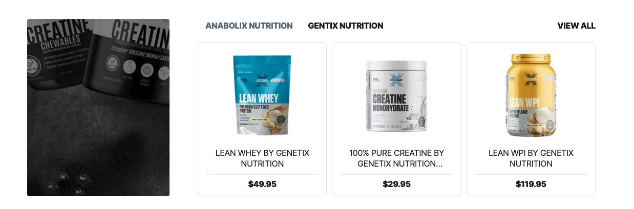
Coll Selector - Lifestyle
Product row section with multiple selectable collections along with their respective lifestyle image.
Properties
- Name
Backgroud Color- Type
- color
- Description
Able to select the background color for the section.
- Name
Half Background- Type
- checkbox
- Description
Enable half background color for the section.
Preview
Static Lifestyle Collection Row
Product row section with multiple selectable collections along with static lifestyle image.
Properties
- Name
Backgroud Color- Type
- color
- Description
Able to select the background color for the section.
Preview
Single Collection Row with Lifestyle Image
Product row section with single collection along with lifestyle image.
Properties
- Name
Dynamic ID- Type
- text
- Description
Add a uniqye id to the section.
- Name
Backgroud Color- Type
- color
- Description
Able to select the background color for the section.
- Name
Use Lifestyle Image- Type
- checkbox
- Description
Enable lifestyle image on the slider.
Preview
Sliding Trust Factor
Sliding trust factors.
Properties
- Name
Show Announcement Bar- Type
- checkbox
- Description
Enable announcement bar section.
- Name
Background Color- Type
- color
- Description
Able to select the background color for the section.
- Name
Content Color- Type
- color
- Description
Able to select the content color.
Preview
