OneMoreRep Sections
On our dedicated sales event features page, we offer a comprehensive overview of all the tools and options at your disposal. From website alterations to code snippets and schema settings, this resource provides you with the insights and guidance needed to make your sales events a resounding success. Explore how you can optimize your online presence, boost conversions, and enhance the customer shopping experience with these powerful features.
Some sections have two "Custom CSS" input boxes. (Added before shopify update). Add CSS to dropdown input if you want the css to affect the individual section only (scoped). Add to input within the section to affect all instances of the section on the page.
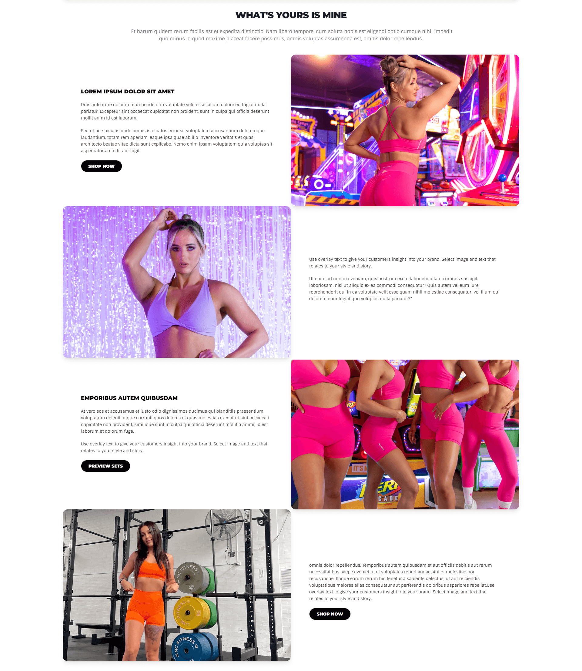
Promo Sets
Section to display promotional images, layout graphics and styled images with text.
Custom CSS Additions
Add these CSS snippets to the Custom CSS input box within the shopify admin theme customizer for the results to show.
- Name
Section Spacing- Type
- Custom CSS
- Description
If additional space is required between two sections, this css will fix the issue.
  /* Section Spcing */
  .promo-sets-info {
    padding-bottom: 20px;
  }
Preview
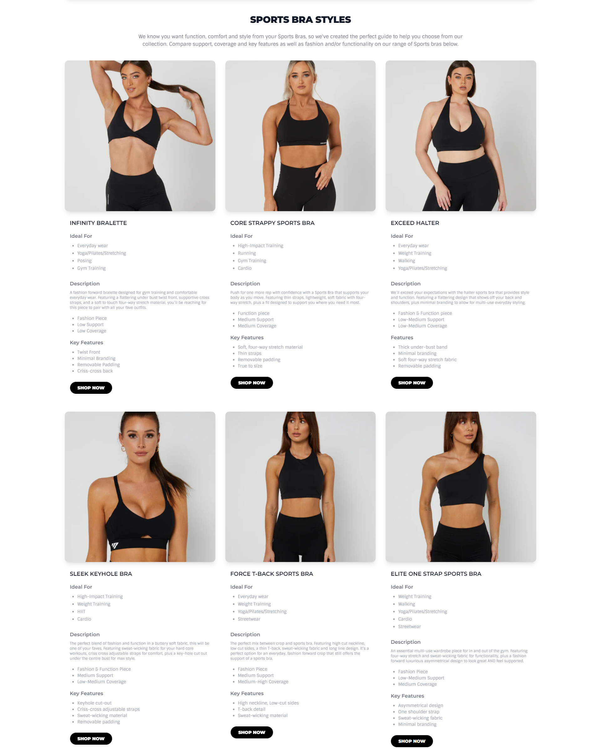
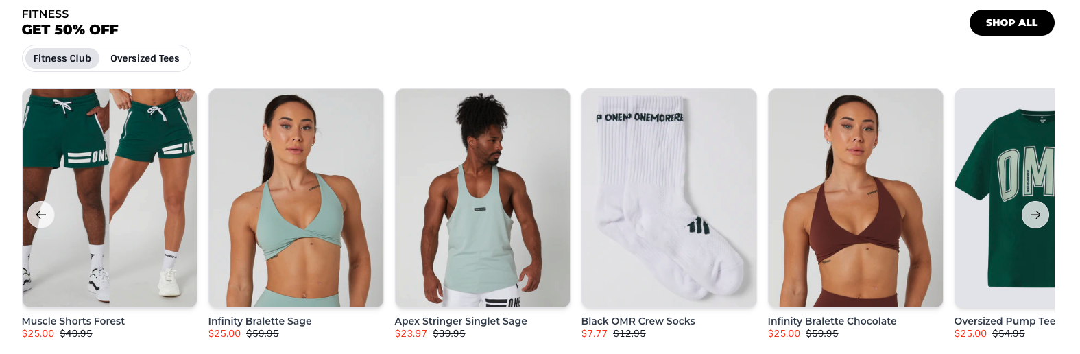
Product Styles Grid
Section to display promotional images and products with their description and other infomation. Can add your own custom description for the product or select particular product to display from the customizer.
Custom CSS Additions
Add these CSS snippets to the Custom CSS input box within the shopify admin theme customizer for the results to show.
- Name
Border Addition- Type
- Custom CSS
- Description
Add this css to add a border to the grid.
  /* Add Border */
.x-size-guide {
    border:solid 1px #e5e7eb;
    padding-bottom: 20px;
    border-radius: .75rem;
    --tw-shadow: 0 1px 2px 0 rgb(0 0 0 / .05);
    --tw-shadow-colored: 0 1px 2px 0 var(--tw-shadow-color);
    box-shadow: var(--tw-ring-offset-shadow, 0 0 #0000),var(--tw-ring-shadow, 0 0 #0000),var(--tw-shadow);
}
Preview
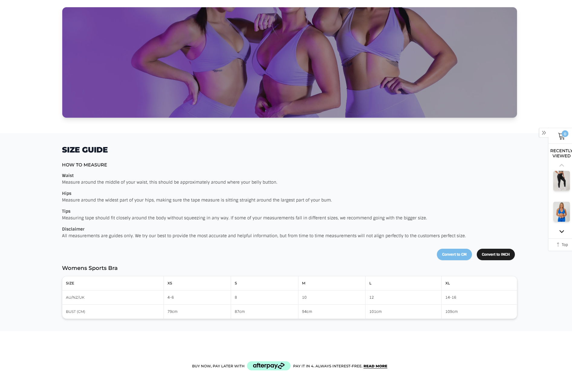
Size Guide
Section to display size guides for different product types.
Preview
Section Boilerplate
Boilerplate code for building sections from scratch
  <div class="x-boilerplate">
    <div class="container {% if section.settings.use_container %} x-container {% endif %} {{ section.settings.css_class }}">
      <h1>Boilerplate</h1>
    </div>
  </div>

  <style>
  {% comment %}/* Section Styles */{% endcomment %}
  #shopify-section-{{ section.id }} .x-boilerplate {
    background: {{ section.settings.background_colour }};
    padding-top: {{ section.settings.padding_top }}px;
    padding-bottom: {{ section.settings.padding_bottom }}px;
    margin-top: {{ section.settings.margin_top }}px;
    margin-bottom: {{ section.settings.margin_bottom }}px;
  }

  /* Mobile */
  @media (max-width: 640px) {}
  /* Mobile */

  {% comment %}/* Container */{% endcomment %}
  #shopify-section-{{ section.id }} .x-container {width: 100% !important; margin: 0 auto;}
  @media (min-width: 640px) {#shopify-section-{{ section.id }} .x-container {max-width: 640px !important;}}
  @media (min-width: 768px) {#shopify-section-{{ section.id }} .x-container {max-width: 768px !important;}}
  @media (min-width: 1024px) {#shopify-section-{{ section.id }} .x-container {max-width: 1024px !important;}}
  @media (min-width: 1280px) {#shopify-section-{{ section.id }} .x-container {max-width: 1280px !important;}}
  @media (min-width: 1536px) {#shopify-section-{{ section.id }} .x-container {max-width: 1536px !important;}}
  {% comment %}/* Container */{% endcomment %}

  {% comment %}/* Advanced */{% endcomment %}
  {{ section.settings.custom_css }}
  {% comment %}/* Advanced */{% endcomment %}
  </style>

  {% schema %}

  {
    "name": "Boilerplate 🏝",
    "class": "x-boilerplate",
    "settings": [
      {
        "type": "header",
        "content": "Layout"
      },
      {
        "type": "checkbox",
        "id": "use_container",
        "label": "Use Container",
        "default": true
      },
      {
        "type": "color",
        "id": "background_colour",
        "label": "Background Colour",
        "default": "#FFF"
      },
      {
        "type": "header",
        "content": "Spacing"
      }, {
        "type": "range",
        "id": "padding_top",
        "label": "Padding Top",
        "default": 50,
        "min": -100,
        "max": 200,
        "step": 5,
        "unit": "px"
      }, {
        "type": "range",
        "id": "padding_bottom",
        "label": "Padding Bottom",
        "default": 50,
        "min": -100,
        "max": 200,
        "step": 5,
        "unit": "px"
      }, {
        "type": "range",
        "id": "margin_top",
        "label": "Margin Top",
        "default": 50,
        "min": -100,
        "max": 200,
        "step": 5,
        "unit": "px"
      }, {
        "type": "range",
        "id": "margin_bottom",
        "label": "Margin Bottom",
        "default": 50,
        "min": -100,
        "max": 200,
        "step": 5,
        "unit": "px"
      }, {
        "type": "header",
        "content": "Advanced"
      }, {
        "type": "text",
        "id": "css_class",
        "label": "CSS Class"
      }, {
        "type": "textarea",
        "id": "custom_css",
        "label": "Custom CSS",
        "info": "Write your css here to make advanced adjustments"
      }
    ],
    "presets": [
      {
        "name": "Boilerplate 🏝",
        "category": "boilerplate"
      }
    ]
  }

  {% endschema %}
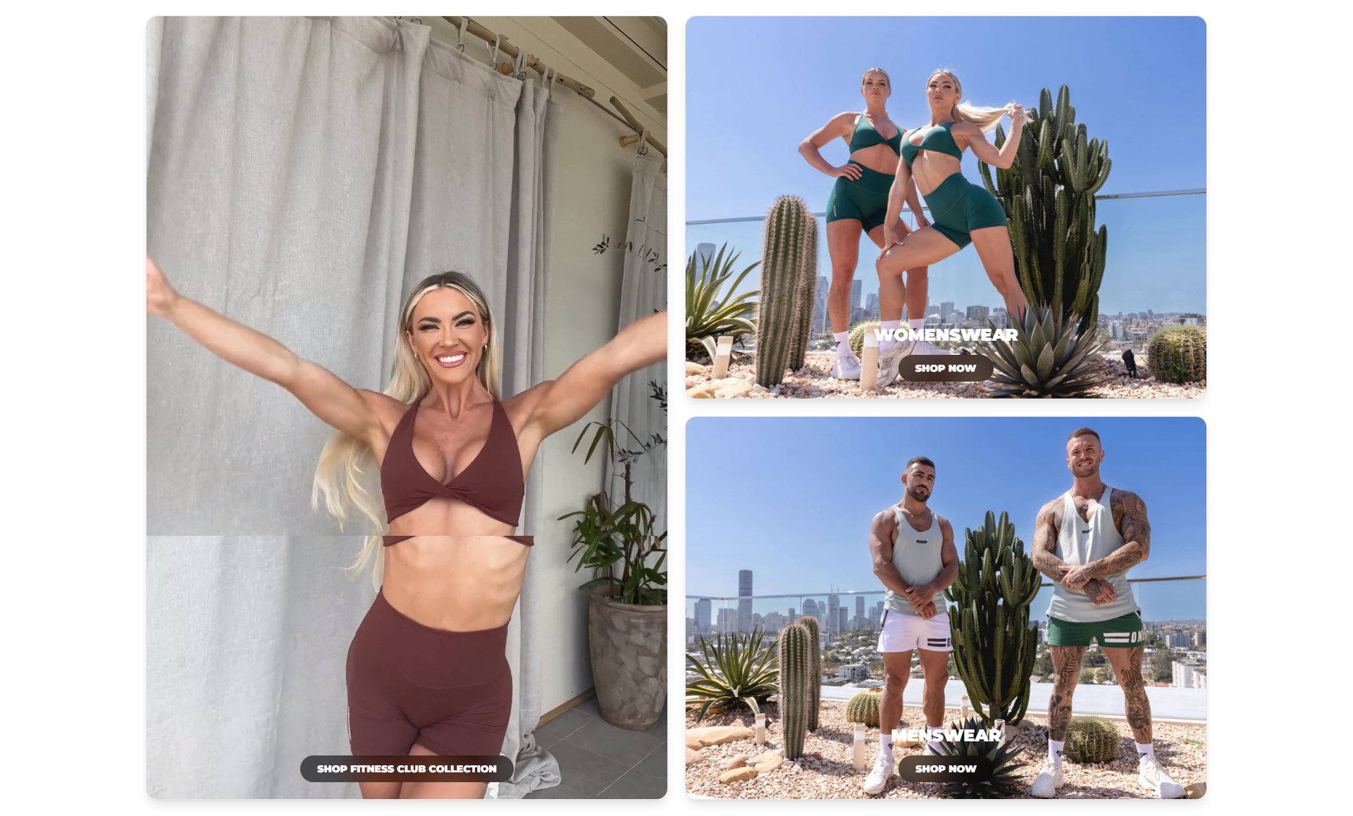
Homepage Three Blocks
Homepage grids for displaying featured products.
Images
- Name
Background image- Type
- JPEG | PNG | GIF
- Description
Example image with inset wording guidelines. 900px by 900px with a 150px bleed (750px by 750px).
Schema
- Name
Dark Mode- Type
- Schema
- Description
Add dark mode to section
- Name
Show Title- Type
- Text
- Description
Add title to the section.
Preview
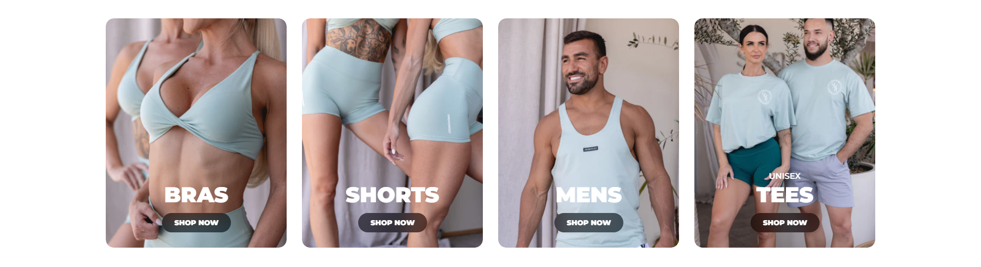
Grid Image
Homepage grids for displaying product categories.
Images
- Name
Background image- Type
- JPEG | PNG | GIF
- Description
Example image with inset wording guidelines.
Schema
- Name
Dark Mode- Type
- Schema
- Description
Add dark mode to section
Preview
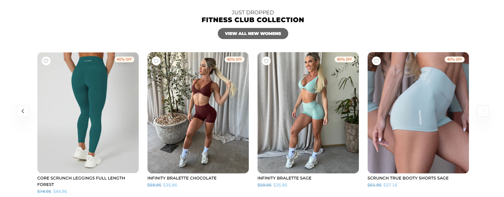
Product Slider
Display products within collection as a sliding row.
Schema
- Name
Grey Background- Type
- Schema
- Description
Add grey background to section
Preview
Text Box
Display featured product or categories.
Schema
- Name
Dark Mode- Type
- Schema
- Description
Add dark background to section.
- Name
Parallax Effect- Type
- Schema
- Description
Enable parallax effect for the background image
Preview
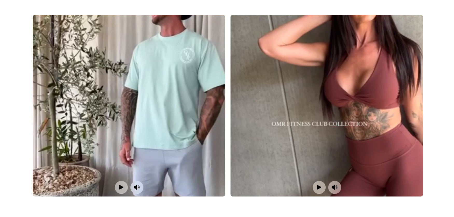
Video Blocks
Display promo videos to the section. Stacks on mobile and has a limit of maximum 3 videos.
Schema
- Name
Dark Mode- Type
- Schema
- Description
Add dark background to section.
- Name
Autoplay Video- Type
- Schema
- Description
Enables to autoplay video by default.
- Name
Mute Video- Type
- Schema
- Description
Enables to play the video whithout a sound.
- Name
Loop Video- Type
- Schema
- Description
Enables to play the video in a loop.
Preview
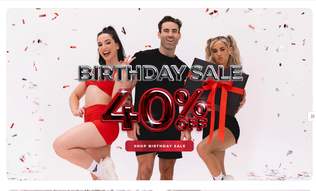
Video Banner
Display the featured video at the homepage banner.
Schema
- Name
Background Color- Type
- Schema
- Description
Allows to set a background color for the section.
Preview
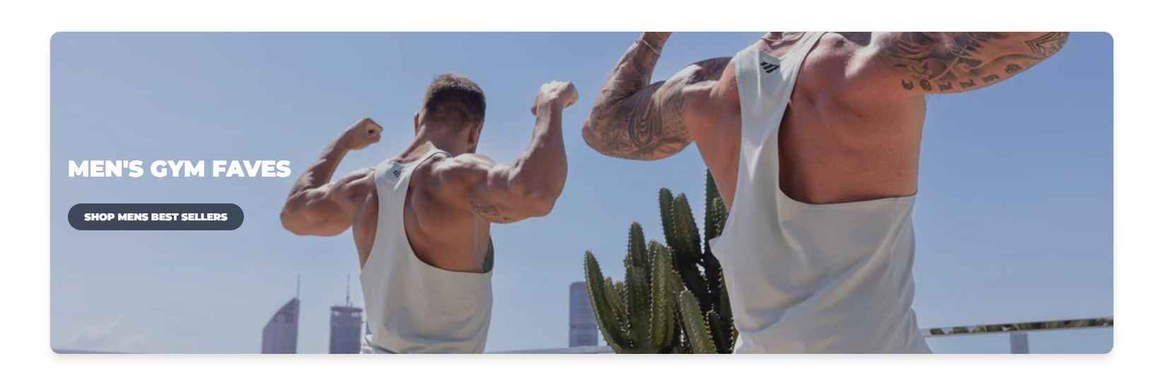
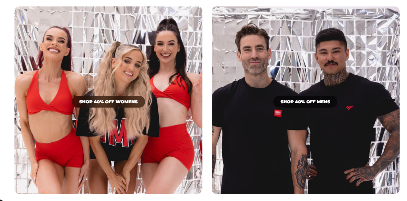
CTA Blocks
Display the featured categories at the homepage. Allows to add a maximum three categories
Preview
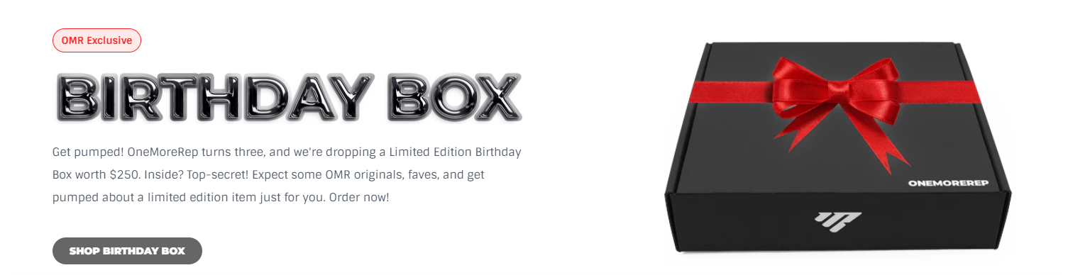
Product Upsell
Showcase the featured product with the information.
Schema
- Name
dark Mode- Type
- Schema
- Description
Allows to set a dark background for the section.
Preview
Double Row Collection
Showcases product collections in two parallel rows.
Schema
- Name
Full Width Slider- Type
- Schema
- Description
Displays the section full width.
- Name
Background Colour- Type
- Schema
- Description
Able to change section background color.
Preview
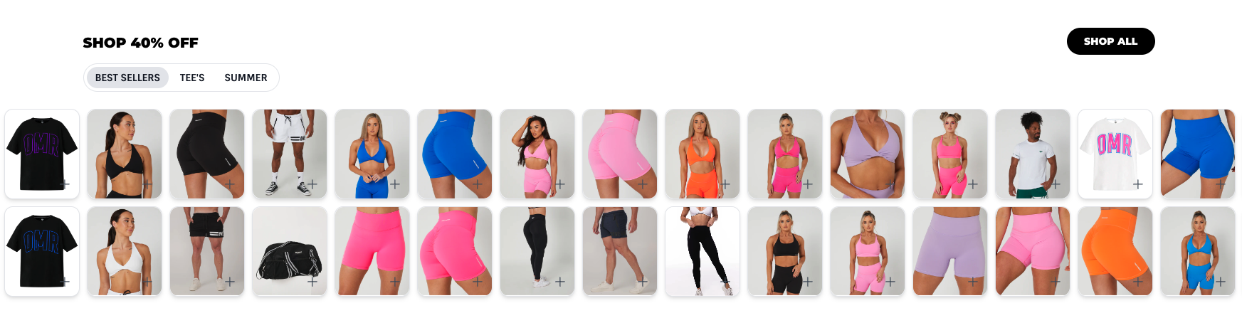
Collection Row
Showcases multiple product collections in a row.
Schema
- Name
Use Dark Mode- Type
- Schema
- Description
Add dark background to section.
- Name
Background Colour- Type
- Schema
- Description
Able to change section background color.
- Name
Use Container- Type
- Schema
- Description
Displays the section inside container.
- Name
Use Navigation Arrows- Type
- Schema
- Description
Enables arrows for slider.
Preview
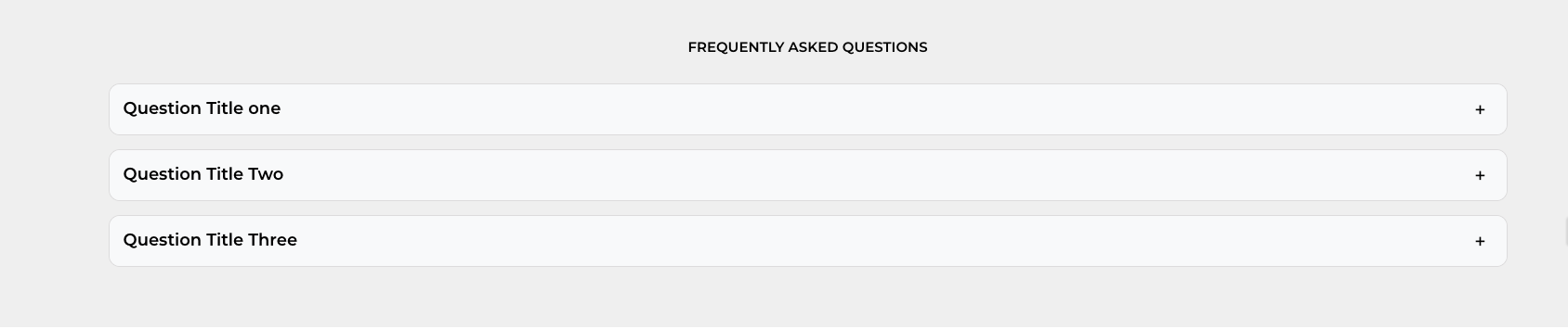
FAQ Accordions
Displays product FAQs.
Schema
- Name
Use Container- Type
- Schema
- Description
Displays the section inside container.
- Name
Background Colour- Type
- Schema
- Description
Able to change section background color.
Preview